


To get started, clone the previous tutorial source code from GitHub.
Navigate to the Google App Engine (GAE) SDK directory and start the server.
1
| ./dev_appserver.py PythonD3jsMashup_Part2/ |
Before getting started, create a new template called
displayChart_3.html which will be the same as displayChart.html. Also add a route for displayChart_3.html. This is done just to keep the demo of the previous tutorial intact, since I'll be hosting it on the same URL.
01
02
03
04
05
06
07
08
09
10
11
12
13
| class DisplayChart3(webapp2.RequestHandler): def get(self): template_data = {} template_path = 'Templates/displayChart_3.html' self.response.out.write(template.render(template_path,template_data)) application = webapp2.WSGIApplication([ ('/chart',ShowChartPage), ('/displayChart',DisplayChart), ('/displayChart3',DisplayChart3), ('/', ShowHome),], debug=True) |
Creating the Visualization Graph (With Sample Data)
From our sample dataset, we have a number ofcount to be plotted across a set of corresponding year.
01
02
03
04
05
06
07
08
09
10
11
12
13
14
15
16
17
18
19
20
21
22
23
24
25
26
27
28
29
30
31
32
33
34
35
36
37
38
39
40
41
42
43
44
45
46
47
48
49
50
51
52
53
54
55
56
57
58
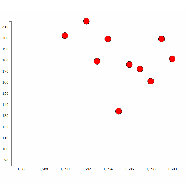
| var data = [{ "count": "202", "year": "1590"}, { "count": "215", "year": "1592"}, { "count": "179", "year": "1593"}, { "count": "199", "year": "1594"}, { "count": "134", "year": "1595"}, { "count": "176", "year": "1596"}, { "count": "172", "year": "1597"}, { "count": "161", "year": "1598"}, { "count": "199", "year": "1599"}, { "count": "181", "year": "1600"}, { "count": "157", "year": "1602"}, { "count": "179", "year": "1603"}, { "count": "150", "year": "1606"}, { "count": "187", "year": "1607"}, { "count": "133", "year": "1608"}, { "count": "190", "year": "1609"}, { "count": "175", "year": "1610"}, { "count": "91", "year": "1611"}, { "count": "150", "year": "1612"}]; |
First, we'll use d3.selectAll to select circles inside the visualization element. If no elements are found, it will return an empty placeholder where we can append circles later.
1
| var circles = vis.selectAll("circle"); |
circles selection.
1
| var circles = vis.selectAll("circle").data(data); |
1
| circles.enter().append("svg:circle") |
cx) and Y (cy) axes, their color, their radius, etc. For fetching cx and cy, we'll use xScale and yScale to transform the year and count data into the plotting space and draw the circle in the SVG area. Here is how the code will look:
01
02
03
04
05
06
07
08
09
10
11
12
13
14
15
16
17
| var circles = vis.selectAll("circle").data(data);circles.enter() .append("svg:circle") .attr("stroke", "black") // sets the circle border .attr("r", 10) // sets the radius .attr("cx", function(d) { // transforms the year data so that it return xScale(d.year); // can be plotted in the svg space }) .attr("cy", function(d) { // transforms the count data so that it return yScale(d.count); // can be plotted in the svg space }) .style("fill", "red") // sets the circle color |
Modifying Google BigQuery to extract relevant data
In the first part of this series, when we fetched data from BigQuery, we selected some 1,000 words.
1
| SELECT word FROM [publicdata:samples.shakespeare] LIMIT 1000 |
Caesar, appears in Shakespeare's work across different years.So, log into Google BigQuery and we'll have a screen like the one shown below:

So our basic query would look like this:
1
| SELECT SUM(word_count) as WCount,corpus_date FROM [publicdata:samples.shakespeare] WHERE word="Caesar" GROUP BY corpus_date ORDER BY WCount |

1
| SELECT SUM(word_count) as WCount,corpus_date,group_concat(corpus) as Work FROM [publicdata:samples.shakespeare] WHERE word="Caesar" and corpus_date>0 GROUP BY corpus_date ORDER BY WCount |

Plotting the Data From Google BigQuery
Next, openapp.py and create a new class called GetChartData. Inside it, include the query statement we created above.
1
2
| queryData = {'query':'SELECT SUM(word_count) as WCount,corpus_date,group_concat(corpus) as Work FROM ''[publicdata:samples.shakespeare] WHERE word="God" and corpus_date>0 GROUP BY corpus_date ORDER BY WCount'} |
queryData.
1
| tableData = bigquery_service.jobs() |
queryData against the BigQuery service and print the result to the page.
1
2
| dataList = tableData.query(projectId=PROJECT_NUMBER,body=queryData).execute()self.response.out.write(dataList) |
GetChartData as shown.
1
2
3
4
5
6
7
| application = webapp2.WSGIApplication([ ('/chart',ShowChartPage), ('/displayChart',DisplayChart), ('/displayChart3',DisplayChart3), ('/getChartData',GetChartData), ('/', ShowHome),], debug=True) |
1
| ./appcfg.py update PythonD3jsMashup_Part2/ |
Next, we'll try to parse the data received from Google BigQuery and convert it into a JSON data object and pass it to the client side to process using D3.js.
First, we'll check if there are any rows in
dataList returned. If no rows, we'll set the response as null or zero.
1
2
3
4
| if 'rows' in dataList: # parse dataListelse: resp.append({'count':'0','year':'0','corpus':'0'}) |
dataList by looping each row and picking up count, year and corpus and creating our required JSON object.
01
02
03
04
05
06
07
08
09
10
| resp = []if 'rows' in dataList: for row in dataList['rows']: for key,dict_list in row.iteritems(): count = dict_list[0] year = dict_list[1] corpus = dict_list[2] resp.append({'count': count['v'],'year':year['v'],'corpus':corpus['v']})else: resp.append({'count':'0','year':'0','corpus':'0'}) |
1
| import json |
1
2
| self.response.headers['Content-Type'] = 'application/json'self.response.out.write(json.dumps(resp)) |
1
2
3
| inputData = self.request.get("inputData")queryData = {'query':'SELECT SUM(word_count) as WCount,corpus_date,group_concat(corpus) as Work FROM ''[publicdata:samples.shakespeare] WHERE word="'+inputData+'" and corpus_date>0 GROUP BY corpus_date ORDER BY WCount'} |
GetChartData finally looks:
01
02
03
04
05
06
07
08
09
10
11
12
13
14
15
16
17
18
19
20
21
22
| class GetChartData(webapp2.RequestHandler): def get(self): inputData = self.request.get("inputData") queryData = {'query':'SELECT SUM(word_count) as WCount,corpus_date,group_concat(corpus) as Work FROM ''[publicdata:samples.shakespeare] WHERE word="'+inputData+'" GROUP BY corpus_date ORDER BY WCount'} tableData = bigquery_service.jobs() dataList = tableData.query(projectId=PROJECT_NUMBER,body=queryData).execute() resp = [] if 'rows' in dataList: for row in dataList['rows']: for key,dict_list in row.iteritems(): count = dict_list[0] year = dict_list[1] corpus = dict_list[2] resp.append({'count': count['v'],'year':year['v'],'corpus':corpus['v']}) else: resp.append({'count':'0','year':'0','corpus':'0'}) self.response.headers['Content-Type'] = 'application/json' self.response.out.write(json.dumps(resp)) |

Templates/displayChart_3.html and include an input box where we'll input keywords to query the dataset.
1
2
3
| <div align="center"> <input id="txtKeyword" type="text" class="span3" placeholder="Type something…"></div> |
GetChartData on Enter Key press.
1
2
3
4
5
6
7
8
| $(document).ready(function() { $("#txtKeyword").keyup(function(event) { if (event.keyCode == 13) { // If enter key press DisplayChart(); } }); InitChart(); // Init Chart with Axis}); |
DisplayChart on the client side, inside which we'll make an Ajax call to the Python GetChartData method.
01
02
03
04
05
06
07
08
09
10
11
12
13
14
15
16
17
| function DisplayChart() { var keyword = $('#txtKeyword').val(); $.ajax({ type: "GET", url: "/getChartData", data: { inputData: keyword }, dataType: "json", success: function(response) { console.log(response); }, error: function(xhr, errorType, exception) { console.log('Error occured'); } });} |
Caesar, and press Enter. Check your browser console and you should see the returned JSON response.Next, let's plot the circles using the returned response. So create another JavaScript function called
CreateChart. This function is similar to the InitChart function but the data would be passed as parameter. Here is how it looks:
01
02
03
04
05
06
07
08
09
10
11
12
13
14
15
16
17
18
19
20
21
22
23
24
25
26
27
28
29
30
31
32
33
34
35
36
37
38
39
40
41
42
43
44
45
46
47
48
49
50
51
52
53
54
55
56
57
58
59
| function CreateChart(data) { var vis = d3.select("#visualisation"), WIDTH = 1000, HEIGHT = 500, MARGINS = { top: 20, right: 20, bottom: 20, left: 50 }, xScale = d3.scale.linear().range([MARGINS.left, WIDTH - MARGINS.right]).domain([d3.min(data, function(d) { return (parseInt(d.year, 10) - 5); }), d3.max(data, function(d) { return parseInt(d.year, 10); }) ]), yScale = d3.scale.linear().range([HEIGHT - MARGINS.top, MARGINS.bottom]).domain([d3.min(data, function(d) { return (parseInt(d.count, 10) - 5); }), d3.max(data, function(d) { return parseInt(d.count, 10); }) ]), xAxis = d3.svg.axis() .scale(xScale), yAxis = d3.svg.axis() .scale(yScale) .orient("left"); vis.append("svg:g") .attr("class", "x axis") .attr("transform", "translate(0," + (HEIGHT - MARGINS.bottom) + ")") .call(xAxis); vis.append("svg:g") .attr("class", "y axis") .attr("transform", "translate(" + (MARGINS.left) + ",0)") .call(yAxis); var circles = vis.selectAll("circle").data(data); circles.enter() .append("svg:circle") .attr("stroke", "black") .attr("r", 10) .attr("cx", function(d) { return xScale(d.year); }) .attr("cy", function(d) { return yScale(d.count); }) .style("fill", "red")} |
InitChart function, remove the circle creation portion since it won't be required now. Here is how InitChart looks:
001
002
003
004
005
006
007
008
009
010
011
012
013
014
015
016
017
018
019
020
021
022
023
024
025
026
027
028
029
030
031
032
033
034
035
036
037
038
039
040
041
042
043
044
045
046
047
048
049
050
051
052
053
054
055
056
057
058
059
060
061
062
063
064
065
066
067
068
069
070
071
072
073
074
075
076
077
078
079
080
081
082
083
084
085
086
087
088
089
090
091
092
093
094
095
096
097
098
099
100
101
102
103
104
105
| function InitChart() { var data = [{ "count": "202", "year": "1590" }, { "count": "215", "year": "1592" }, { "count": "179", "year": "1593" }, { "count": "199", "year": "1594" }, { "count": "134", "year": "1595" }, { "count": "176", "year": "1596" }, { "count": "172", "year": "1597" }, { "count": "161", "year": "1598" }, { "count": "199", "year": "1599" }, { "count": "181", "year": "1600" }, { "count": "157", "year": "1602" }, { "count": "179", "year": "1603" }, { "count": "150", "year": "1606" }, { "count": "187", "year": "1607" }, { "count": "133", "year": "1608" }, { "count": "190", "year": "1609" }, { "count": "175", "year": "1610" }, { "count": "91", "year": "1611" }, { "count": "150", "year": "1612" }]; var color = d3.scale.category20(); var vis = d3.select("#visualisation"), WIDTH = 1000, HEIGHT = 500, MARGINS = { top: 20, right: 20, bottom: 20, left: 50 }, xScale = d3.scale.linear().range([MARGINS.left, WIDTH - MARGINS.right]).domain([d3.min(data, function(d) { return (parseInt(d.year, 10) - 5); }), d3.max(data, function(d) { return parseInt(d.year, 10); }) ]), yScale = d3.scale.linear().range([HEIGHT - MARGINS.top, MARGINS.bottom]).domain([d3.min(data, function(d) { return (parseInt(d.count, 10) - 5); }), d3.max(data, function(d) { return parseInt(d.count, 10); }) ]), xAxis = d3.svg.axis() .scale(xScale), yAxis = d3.svg.axis() .scale(yScale) .orient("left"); vis.append("svg:g") .attr("class", "x axis") .attr("transform", "translate(0," + (HEIGHT - MARGINS.bottom) + ")") .call(xAxis); vis.append("svg:g") .attr("class", "y axis") .attr("transform", "translate(" + (MARGINS.left) + ",0)") .call(yAxis);} |
/displayChart3 page, circles won't be displayed. Circles will only appear once the keyword has been searched. So, on the success callback of the DisplayChart Ajax call, pass the response to the CreateChart function.
1
2
3
4
| success: function(response) { console.log(response); CreateChart(response);} |
Caesar. OK, so now we get to see the result as circles on the graph. But there is one problem: both the axes get overwritten.
CreateChart function if the axes are already there or not.
01
02
03
04
05
06
07
08
09
10
11
12
13
14
| var hasAxis = vis.select('.axis')[0][0];if (!hasAxis) { vis.append("svg:g") .attr("class", "x axis") .attr("transform", "translate(0," + (HEIGHT - MARGINS.bottom) + ")") .call(xAxis); vis.append("svg:g") .attr("class", "y axis") .attr("transform", "translate(" + (MARGINS.left) + ",0)") .call(yAxis);} |

Wrapping It Up
Although all looks good now, still there are a few issues which we'll address in the next part of this tutorial. We'll also introduce D3.js transitions and a few more features to our D3.js graph, and try to make it more interactive.The source code from this tutorial is available on GitHub.
No comments:
Post a Comment